User Testing
The last step of the course was to do some user testing on the final prototype, which already had gone through a couple of iterations, and also test some alternatives on the prototype.
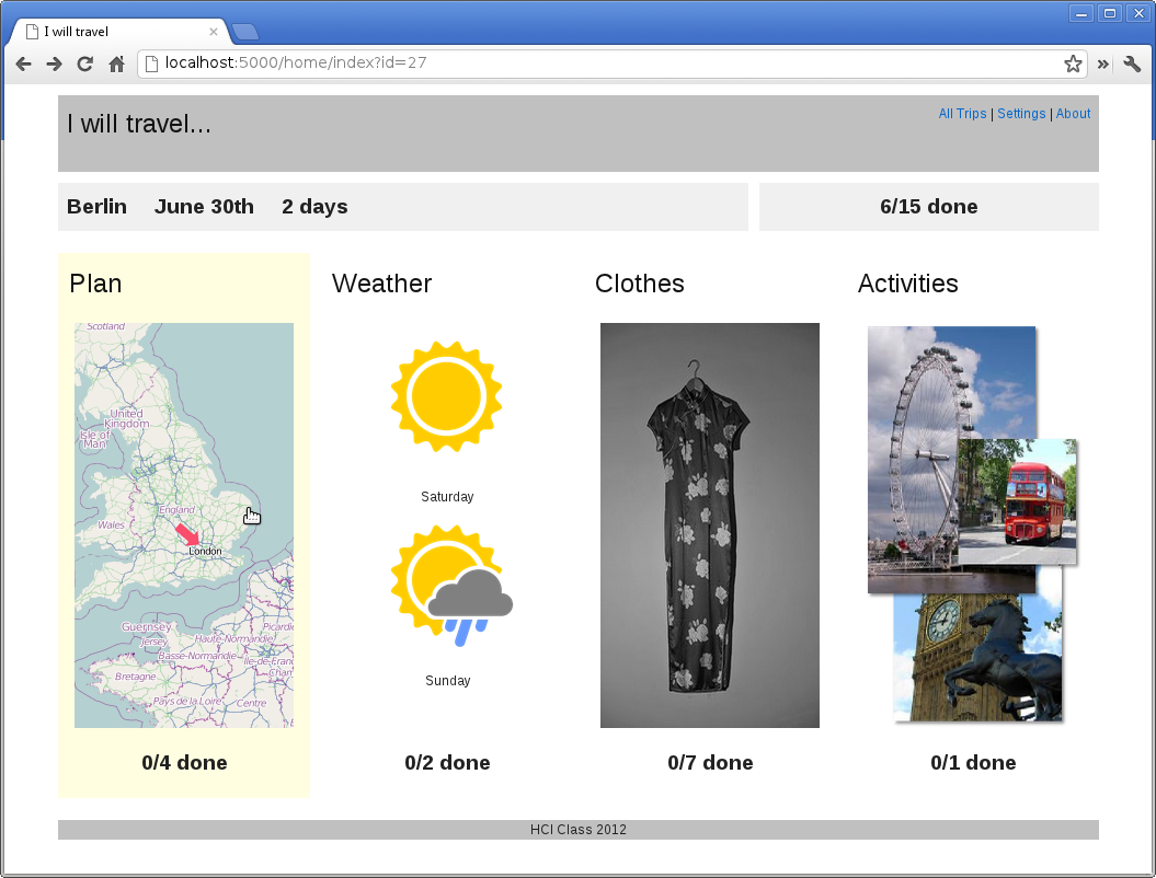
Prototype for User Testing
My final prototype covered the most essential elements of my application, although not everything was fully functional and the implementation was just a quick hack. But it was good enough to cover the questions from my evaluation plan and also test two alternatives for the initial trip creation wizard.
I used Heroku to run a live instance of the prototype and perform the user testing.
Script for User Testing
For the test I prepared a script to make sure that my tests were comparable and consistent:
# Script for user test assignment 5 HCI course

## Introduction

* Welcome
* Goal of this session is to test a prototype for a personal travel assistant
web site, which helps with creating and managing travel check lists.
* Prototype is not complete, some functionality is only there as a stub. I'll
help where you run into limitations of the prototype.
* The test is about testing the app, not you.
* Procedure: five tasks, think aloud, interview at the end
* Think aloud: Use the app to accomplish the task and speak what you think, so
I can take notes
* Questions?

## Start test

* Sign consent form
* Make yourself comfortable in front of your computer
* Go to http://iwilltravel.heroku.com

## Tasks

Maximum 5 minutes per task.

* Task 1: Create a trip to London. You are leaving on July 20th and are coming
back the Sunday afterwards.
* Task 2: Add two tasks to your checklist: Pack elegant shoes for the opera, and
buy tickets for the opera.
* Task 3: Remove the task for packing a hat.
* Task 4: Add a task you think you would need to accomplish if you would travel
to London
* Task 5: You have booked flight and hotel, check off the todo items.

* Task 6, comparative feedback, use alternative interface at
http://iwilltravel.heroku.com/start/enter: Create a trip to London. You are
leaving on July 20th and are coming back the Sunday afterward.

## Interview

* Demographic data: age, gender, profession
* Where were stumbling blocks?
* How did the prototype help compared to a paper todo list?
* Where could the prototype give more support?

## End test

* Thank you
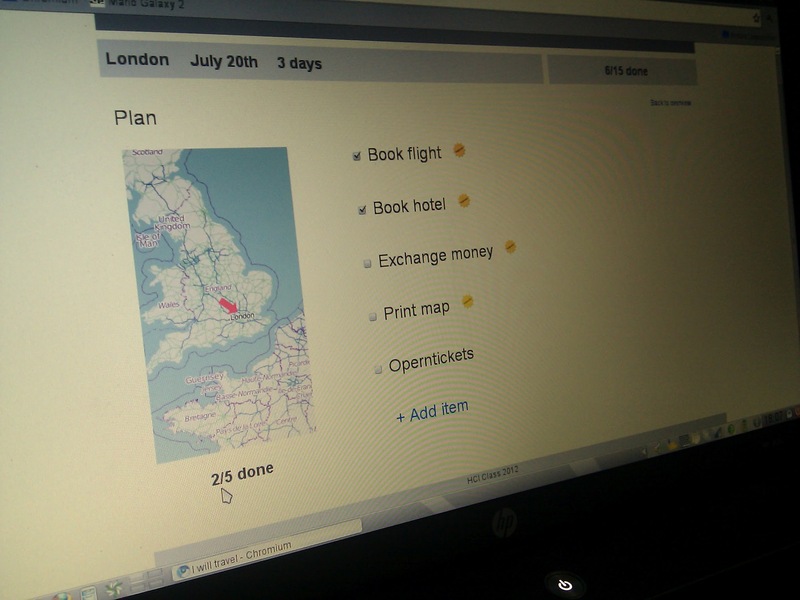
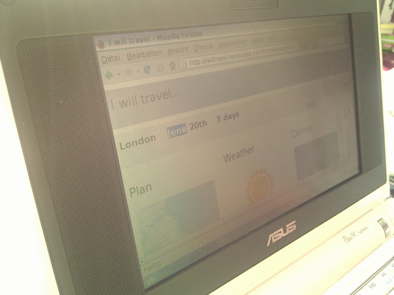
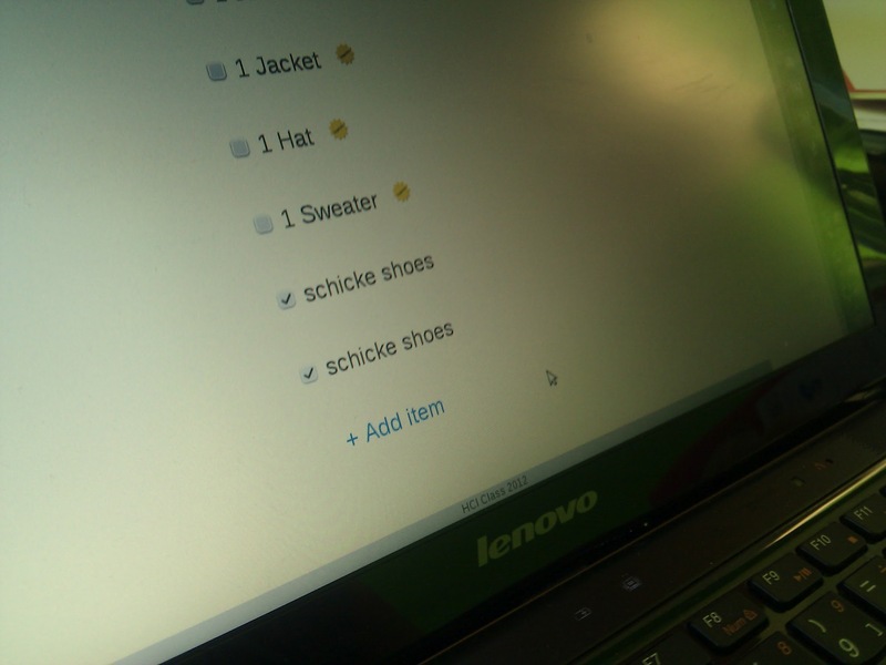
Observations from User Tests
The tests revealed some interesting insights. I captured some key moments with pictures:
Summary of Findings
As a result I summarized what I observed and found out during the user tests.
# Findings user tests

## Start

* Users were confused about date arrangement of date picker which didn't use a
  localized format.
* Users did mistaked when entering the dates. This might partly be to them not
  completely remembering the instructions as it was a kind of artificial setting,
  but it shows in any case, that mistakes have to be considered and a way to
  correct them has to be provided.
* For editing the trip data, the controls weren't obvious how to get there.

## Overview and navigation

* Realizing that the home screen overview is a list of tasks wasn't obvious to
  the users doing the tests, as there isn't mentioned anywhere that it's a list
  of tasks.
* Navigating between the details and overview pages wasn't obvious. While using
  the back button of the browser also works, the navigation could be made more
  clear, especially for going back from details to overview.

## Details

* Auto-suggestions weren't obvious. Users didn't get the meaning of the
  auto-suggestion icon.
* Entering new tasks generally works well. Might need a way to modify number of
  items, e.g. for clothes as part of a task, though.
* It needs to be clearer what checking the items means and when state is saved.

## General

* Application works less well on very small screens.
* Application needs to be available on the go as well, e.g. as mobile version or
  phone app.

## Comparative feedback for alternative start workflows

The tests didn't generate a significant tendency for one of the alternatives.
Each alternative was preferred by one user, and the third user didn't perceive a
relevant difference. More testing is needed to get a better understanding here.
Changes
The user tests revealed a couple of weak points. So I came up with a list of changes, which would needed to address them. I didn't implement them anymore, but this could be the base for developing the prototype into an actual application.
# Changes

* Inline editing for trip details on overview page, as this seems to be more
  natural for users.
* Add a page explaining and listing auto-suggestions, when the trip details are
  entered, so that the logo and the concept of auto-suggestions is introduced
  before it's shown on the check lists.
* Make the "back to overview" link more prominent, so that users more easily
  find it.
* Consider adding the section titles as navigation on all details screens, to
  allow for quicker and more natural navigation.
* Add a subtle "saving..." message when checking checkboxes, so that users are
  clear about what data is saved.
* Localize site, especially date settings, so that users are not confused by
  date or calendar formats not common in their locale.